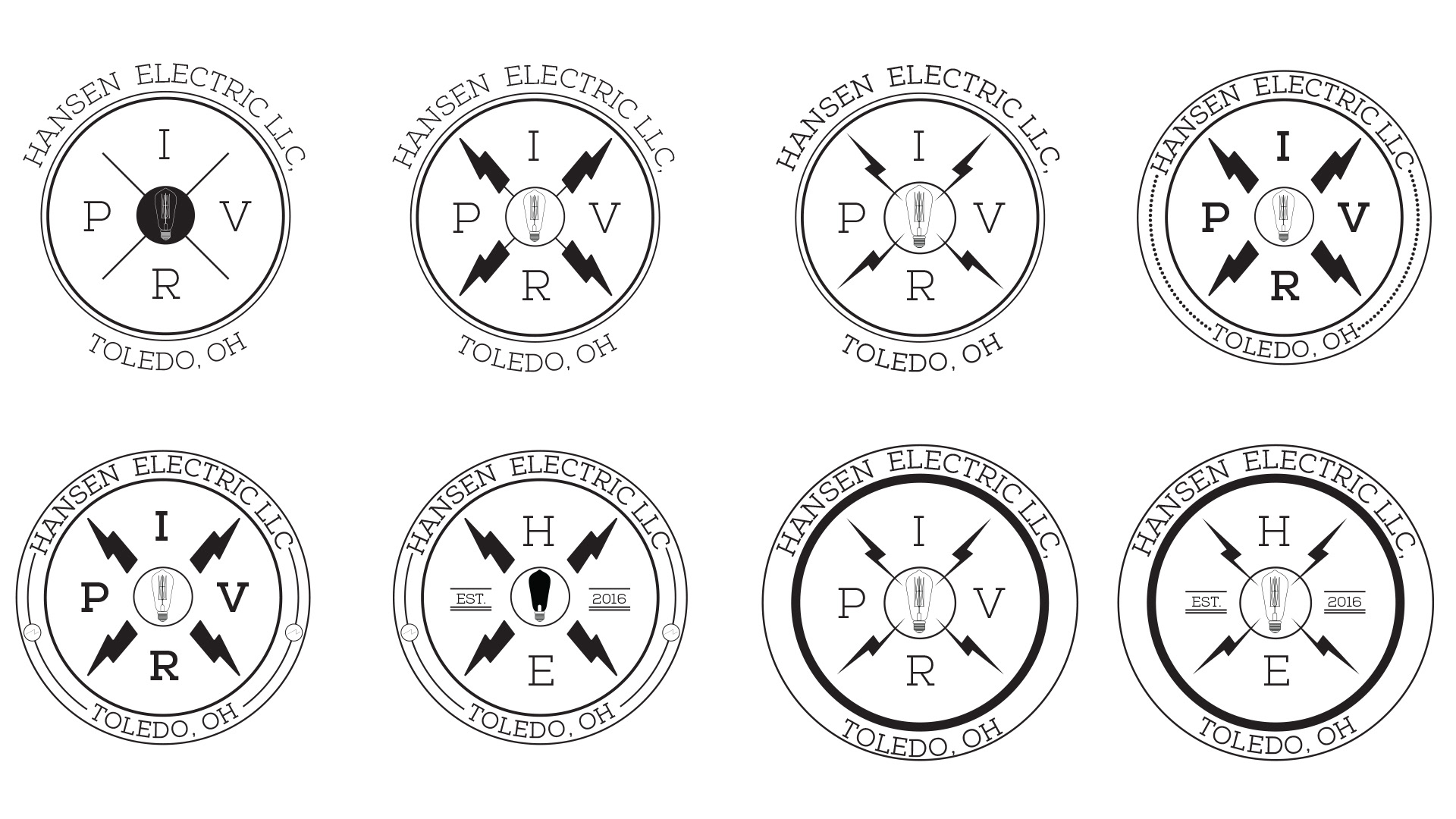
I was hired to create a logo for a local Electrician in Toledo, Ohio. The original ask was to add the IPVR to the design which stands for I = Current (amps) P = Power (watts) V = Voltage (volts) R = Resistance (ohms). He stated he wanted it to incorporate something to do with electricity such as bolts, current, circuits, or light bulb.
My initial designs were based off of old Electric workers Union badges incorporating the IPVR as a motto with the lighting bolts breaking up each instead of a simple line. The typeface chosen was Nexa to give not only more of a vintage feeling, but also keeping itsomewhat modern and fresh. In the middle I chose to use an Edison style lightbulb that I created in Illustrator from a higher res photo of one.
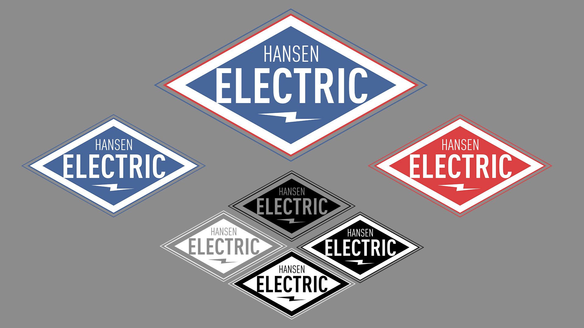
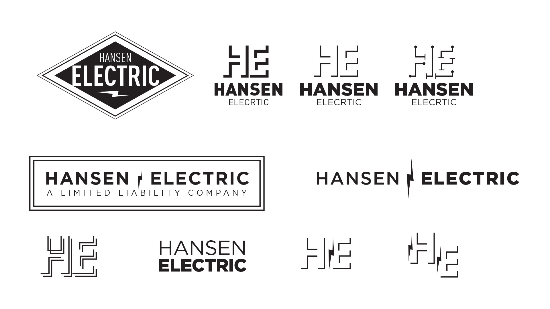
The other page of logos were still a little more modern using a san serif Din typeface with the triangle emblem emphasizing on Electric which was the final logo they chose. The HE logo was created using negative space and strokes. I got my inspiration for that logo through open and closed circuits where i created one that portrayed the circuit diagram better. The rest of the styles i played with a mixture of Type an incorporating the circuitry style as well as a electrical bolt.
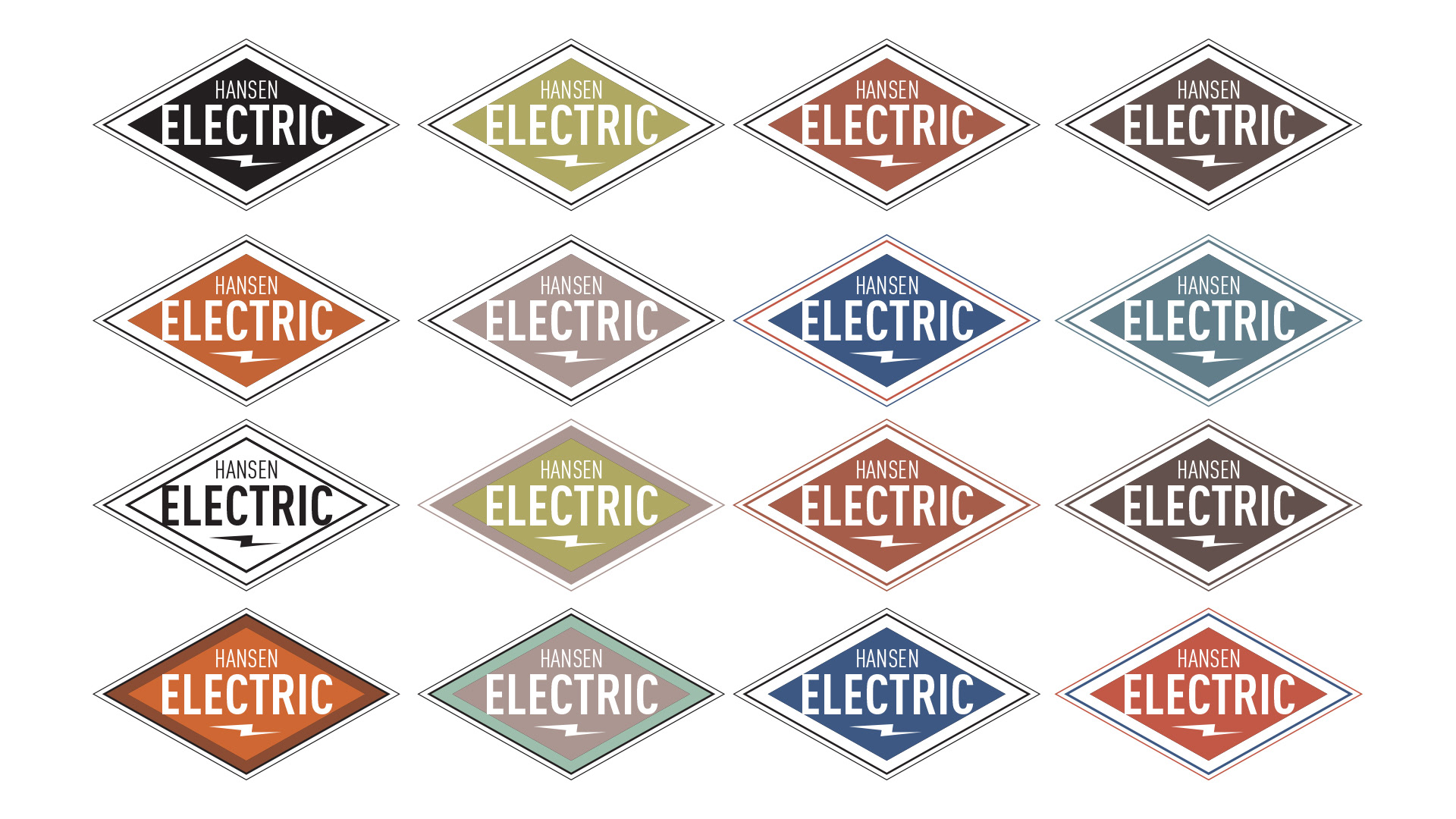
Once chosen, still going with a more vintage feel, I selected muted tones for the logo that I felt worked well and popped off the page towards the viewer making it easier to see on the side of a van or truck as well as a T-shirt or other items to print on.
Frist round of Logo Design
First round of logo Design
Color choice for logo selected